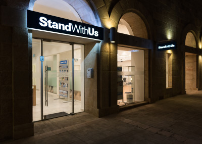
The ‘Stand With Us’ team brief was to create a ‘flagship’ office. I, together with Interior Designer, Shoshana Baumgarten, set about to make this a reality. The site was an empty shell in a great location.


As well as providing the physical space that the STAND WITH US offices and Education centre needed, the client wanted the office to embody the ‘Israel’ brand that they advocate for every day at home and abroad. Their logo was our starting point. We used this ‘blue and white’ as a running theme throughout the office, treading the fine line between branding and ‘kitch’.
![]()
Outside Signage:
The offices are location in downtown Jerusalem, opposite the King David Hotel. SWU wanted their offices to be visible from the street and for it to feel approachable for visitors. We designed the signage embody their logo in a simple, sleek and elegant way; which would be effective both in the day and night.

Furniture:
We incorporated the ‘blue and white’ theme in a couple of choice furniture pieces that are both feature points in the office and display their promotional material. This was the reception desk and the back storage system. The rest of the furniture we kept simple and white, so that the blue stands out as a running feature. We also used wood in some choice areas to soften the look.
Front Reception Desk
Back Storage Unit
We also used a blue carpet under the work stations which both works to muffle the acoustics and also brings a glimpse of ‘blue’ to the eye.
Bathrooms:
The bathrooms are another feature point in the office. This uses the ‘blue’ and ‘white’ in a playful and striking way.

Glass:
The partition walls in the office are primarily glass and allow for glimpses of the office throughout. This allowed us to limit the ‘blue’ colour to small areas that could be seen from far. Likewise, the glass street front allows for views in.


