post

Sourcing Materials: SKS’s Ceramic Secrets

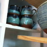
Working in Jerusalem, you get to know all the regular haunts. The tile shops, the lighting shops, the glass suppliers etc. All these are crucial to a successful build but can get a bit repetitive after a while. Especially when you are looking for something a bit different. There are a number of independent artists who make things to order like sinks, lights, tiles, wood cuttings etc that don’t cost a fortune and can really enhance the design.

I am going to share with you a few of my ceramic secrets….

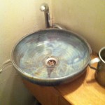
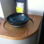
Washing sink….
When searching for the perfect ‘washing sink’ for the lounge/ dining area in the ‘Rechavia’ project, I found lots of beautiful sinks that were ‘almost right’ but not what we were searching for. We happened upon a gorgeous sink in a small Jerusalem restaurant and asked for the details of the ceramic artist, Eran Ophir. He had a studio right next to the framing shop on Rechov Azza. The sink cost the same as those other sinks we were looking at, and added so much more to the design, colour and level of texture of the apartment. It was perfect.

IMG_8968_1024 IMG_3688_1024

Hand Washing Sink

Lighting….
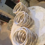
In the ‘STAND WITH US’ project (done together with Shoshana Baumgarten), we were searching for 3 small lights to go over the reception desk and happened upon ceramic artist, Ilana Yarden, from Menoramika at the Jerusalem Lights Festival. Her studio is located in Beit Neqofa (http://www.menoramika.com/) Her lights are unusual, pretty and add a softness to design. We chose the spiral lights incorporating the three main colours of the STAND WITH US office (blue, grey and white).

IMG_3280_1024 IMG_3935_1024 IMG_3281_1024

lights

Tiles….

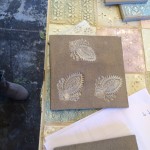
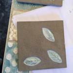
She also happens to share a studio with a tile artist, Yael Goldsmith, who makes amazing customised patterned tiles

IMG_3934_1024 IMG_3293_1024 IMG_3292_1024 IMG_3291_1024 IMG_3290_1024 IMG_3289_1024

Her tiles will form a ‘wall of support’ in the ‘STAND WITH US’ office as part of a current ‘buy a tile, build our centre’ fundraising campaign for STANDWITHUS (http://jewcer.com/user/swu). Watch this space…..

Any other ceramic secrets?

post

Interior Design: SKS’s Stairs and Storage

Stairs have to be practical, comfortable and have the right measurements. But they can also be a key design element in a home…..
In the Rechavia project we decided to use a spiral staircase. The practical limitations of the spiral were not relevant as the client could use the apartment blocks’ elevator or stairs to carry large items up to the next floor.
We saw the stairs as way of linking public and private space whilst also being a strong design feature in the apartment. We also saw it an an opportunity to create clever storage space both underneath and around it, whilst hiding the structural supports needed.1- Design

The design of the staircase was complex as one run of a spiral couldn’t fit enough stairs to climb a floor so we added some stairs before climbing the spiral and two stairs afterwards.

C:Documents and SettingsDanielMy Documentssarah2-NARKIS18


IMG_3152_1024IMG_6358_1024IMG_8570_1024


We went for thin grey metal stairs with a warm wood on the top. The wood visually linked the stairs with the wooden built-in units downstairs and provided a visual transition to the laminate flooring upstairs. The stairs were built by Yoav Goren.

IMG_0803_4_5

Upstairs we purposely used laminate flooring which were ‘wood-like’ but in a greyscale. This highlights the warmth and authenticity of the wood on the stairs.

IMG_0843


2- Negative space
The curved stairs fit into a square space. The corners left became a point of interest rather than left over space. We used the corner on the outside space to create an extra deep display and storage space (more about that later) and the inner corner became a shelf to bring colour to the stairs. The hanging light feature from the ceiling added to the ‘wow’ factor and brought it all together.

DSC_0166 DSC_0165


3- Storage

The low unit surrounding the stairs also doubled as a safety rail. The unit built around the stairs has closed cupboard space below, a built in table and shelving for display.

IMG_0802
Under the stairs is a large walk in storage space. The doors are from ‘shleiflack’ (baked wood) and are the same colour as the walls, therefore blending into the apartment.


post

Stand With Us: Branding ‘כחול לבן’


The ‘Stand With Us’ team brief was to create a ‘flagship’ office. I, together with Interior Designer, Shoshana Baumgarten, set about to make this a reality. The site was an empty shell in a great location.

IMG_0398_1024
IMG_0390_1024
As well as providing the physical space that the STAND WITH US offices and Education centre needed, the client wanted the office to embody the ‘Israel’ brand that they advocate for every day at home and abroad. Their logo was our starting point. We used this ‘blue and white’ as a running theme throughout the office, treading the fine line between branding and ‘kitch’.

IMG_3470_1024
Outside Signage:

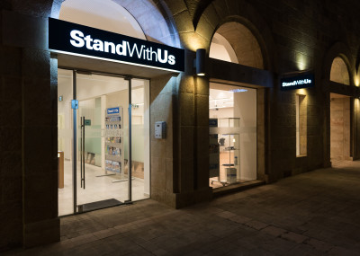
The offices are location in downtown Jerusalem, opposite the King David Hotel. SWU wanted their offices to be visible from the street and for it to feel approachable for visitors. We designed the signage embody their logo in a simple, sleek and elegant way; which would be effective both in the day and night.


SWU-1513SWU-1511

SWU-1576

SWU-1556

Furniture:

We incorporated the ‘blue and white’ theme in a couple of choice furniture pieces that are both feature points in the office and display their promotional material. This was the reception desk and the back storage system. The rest of the furniture we kept simple and white, so that the blue stands out as a running feature. We also used wood in some choice areas to soften the look.

Front Reception Desk

SWU-2892SWU-2897SWU-2885


Back Storage Unit

SWU-2912SWU-1489

SWU-2917


We also used a blue carpet under the work stations which both works to muffle the acoustics and also brings a glimpse of ‘blue’ to the eye.

Bathrooms:
The bathrooms are another feature point in the office. This uses the ‘blue’ and ‘white’ in a playful and striking way.

SWU-1448

SWU-1459


Glass:
The partition walls in the office are primarily glass and allow for glimpses of the office throughout. This allowed us to limit the ‘blue’ colour to small areas that could be seen from far. Likewise, the glass street front allows for views in.


SWU-1371

SWU-3042


Click here for images of the rest of the office….